This is a map used to represent the top level domain (TLD) name system of the internet. The TLDs are visualized and linked as KML. The map and additional info on this project can be found at http://www.zook.info/tld_map.html
Tuesday, October 14, 2008
Map# 51: Remote Sensing Mapping
This is a map used to represent the top level domain (TLD) name system of the internet. The TLDs are visualized and linked as KML. The map and additional info on this project can be found at http://www.zook.info/tld_map.html
Sunday, October 12, 2008
Map# 50: Star Plots
Star Plots show multiple varying data. When combined with other star plots, the viewer can compare a variety of observations. This analysis shows star plots for 16 different 1979 automobile models comparing 9 different variables of Price, Mileage (MPG), 1978 Repair Record (1 = Worst, 5 = Best), 1977 Repair Record (1 = Worst, 5 = Best), Headroom, Rear Seat Room, Trunk Space, Weight, and Length.
Map# 49: Correlation Matrix
A Correlation Matrix shows the strength and direction of relationship between two variables, or simply put, how closely correlated two items under consideration are. In the financial world, this could be used to depict how closely related two different stocks are or, as this correlation matrix does, showing correlations between the S & P 500, 10 different sectors, gold, oil, and the 10 year Treasury note. The numbers in green show higher correlation than numbers in red.
Map# 48: Similarity Matrix
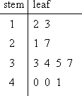
Map# 47: Stem and Leaf Plot

A Stem and Leaf Plot organizes data in order to show its shape and distribution. In this instance, the number 12 is depicted as 1 under the stem, and 2 under the leaf. Likewise, 13 is depicted as 1 under the stem and 3 under the leaf. This stem and leaf plot shows a distribution of 2 values between 10 and 19, 2 values between 20 and 29, 4 values between 30 and 39, and 3 values between 40 and 49. The largest distribution is between 30 and 39. This plot can be found at the following web site: http://www.glencoe.com/sec/math/studytools/cgi-bin/msgQuiz.php4?isbn=0-02-833050-1&chapter=2&lesson=6
Map# 46: Box Plot
Map# 45: Histogram
Subscribe to:
Comments (Atom)