This is a map used to represent the top level domain (TLD) name system of the internet. The TLDs are visualized and linked as KML. The map and additional info on this project can be found at http://www.zook.info/tld_map.html
Tuesday, October 14, 2008
Map# 51: Remote Sensing Mapping
This is a map used to represent the top level domain (TLD) name system of the internet. The TLDs are visualized and linked as KML. The map and additional info on this project can be found at http://www.zook.info/tld_map.html
Sunday, October 12, 2008
Map# 50: Star Plots
Star Plots show multiple varying data. When combined with other star plots, the viewer can compare a variety of observations. This analysis shows star plots for 16 different 1979 automobile models comparing 9 different variables of Price, Mileage (MPG), 1978 Repair Record (1 = Worst, 5 = Best), 1977 Repair Record (1 = Worst, 5 = Best), Headroom, Rear Seat Room, Trunk Space, Weight, and Length.
Map# 49: Correlation Matrix
A Correlation Matrix shows the strength and direction of relationship between two variables, or simply put, how closely correlated two items under consideration are. In the financial world, this could be used to depict how closely related two different stocks are or, as this correlation matrix does, showing correlations between the S & P 500, 10 different sectors, gold, oil, and the 10 year Treasury note. The numbers in green show higher correlation than numbers in red.
Map# 48: Similarity Matrix
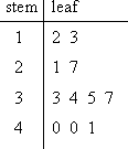
Map# 47: Stem and Leaf Plot

A Stem and Leaf Plot organizes data in order to show its shape and distribution. In this instance, the number 12 is depicted as 1 under the stem, and 2 under the leaf. Likewise, 13 is depicted as 1 under the stem and 3 under the leaf. This stem and leaf plot shows a distribution of 2 values between 10 and 19, 2 values between 20 and 29, 4 values between 30 and 39, and 3 values between 40 and 49. The largest distribution is between 30 and 39. This plot can be found at the following web site: http://www.glencoe.com/sec/math/studytools/cgi-bin/msgQuiz.php4?isbn=0-02-833050-1&chapter=2&lesson=6
Map# 46: Box Plot
Map# 45: Histogram
Map# 44: Parallel Coordinate Graph
Map# 43: Triangular Plot
Map# 42: Windrose
Map# 41: Climograph
Map# 40: Population Profile
Map# 39: Scatterplot
Map# 34: Univariate Choropleth Map
Map# 33: Bivariate Choropleth Map
Map# 32: Unclassed Choropleth Map
Map# 31: Classed Choropleth Map
Map# 30: Range Graded Proportional Circle Map
Map# 29: Continuously Variable Proportional Circle Map
Thursday, October 9, 2008
Map# 28: Digital Ortho Quarter Quads (DOQQ) Map.
Digital Orthophotos are images which depict a uniform scale. Because of this, it is possible to measure directly on it like other maps. These maps can be used as base maps for additional overlays for a variety of information. The example above is a 3-D view of Salem, NY. This map was produced with complicated mapping techniques detailed at Terrainmap.com edited by John Childs.
Wednesday, October 8, 2008
Map# 27: Digital Elevation Model (DEM)
DEMs are the most used basis for digitally produced relief maps. These maps are a digital representation of ground surface topography or various terrain. They are formed from either land surveying or, more often, remote sensing techniques. They are also called digital terrain models. Notice the level of detail that is obtained on the DEM map above.
Map# 26: Digital Line Graph (DLG)
Above is a DLG 1: 2,000,000 scale map of Missouri depicting Boundaries, hydrography, and roads. DLG maps are derived from USGS DLG databases. They are high resolution maps containing outlines of a variety of features such as: country and coast lines, state outlines, county outlines, roads, railroads, streams, lakes and islands, major city outlines, and military reservations to name a few.
Subscribe to:
Comments (Atom)